Widget Configuration
Feature Overview
The Widget Configuration feature allows administrators to customize how the booking/search widget appears and behaves on the company website. Using this feature, admins can control visible sections, language, currency, search behavior, UI theme, and input fields shown to end users. This ensures the widget matches both business requirements and website branding.
Navigation Path
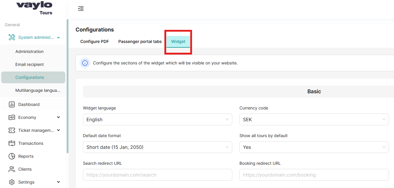
System Administration → Configuration → Widget
Step-by-Step: Configure Widget
Step 1: Access Widget Configuration
- Log in to the admin dashboard
- Navigate to System Administration from the left sidebar
- Click on Configuration
- Select the Widget tab
Step 2: Configure Basic Settings
- Scroll to the Basic Configuration section
- Select Widget language from the dropdown menu
- Choose Currency code (e.g., USD, EUR, BDT)
- Set Trips to display per page (recommended: 15-20)
- Select Default date format (e.g., DD/MM/YYYY)
- Toggle Show all tours by default (ON/OFF)
- Enter Class name prefix if you need custom CSS styling
- Enter Search redirect URL (where users go after searching)
- Enter Booking redirect URL (where users go to complete booking)
- Enter Booking success redirect URL (where users go after successful booking)
- Click Save or Update button
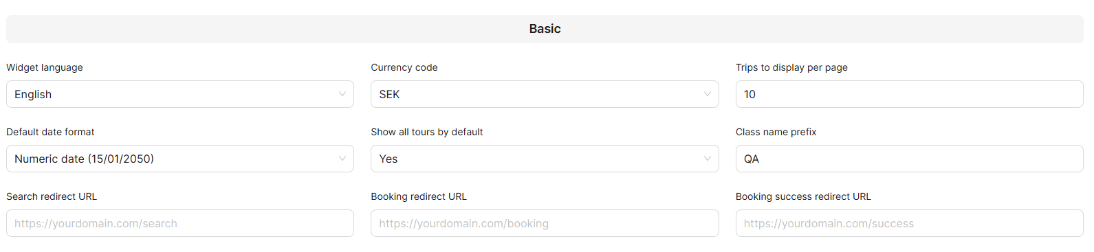
Test all redirect URLs before saving to ensure they work correctly. Broken URLs will disrupt the user journey.
Step 3: Configure Search Parameters
- Scroll to the Search Parameters Configuration section
- Review the list of available search inputs
- Drag & drop to reorder inputs based on priority
- Toggle ON/OFF switches to show/hide specific inputs
- Consider which fields are most important for your users
- Click Save
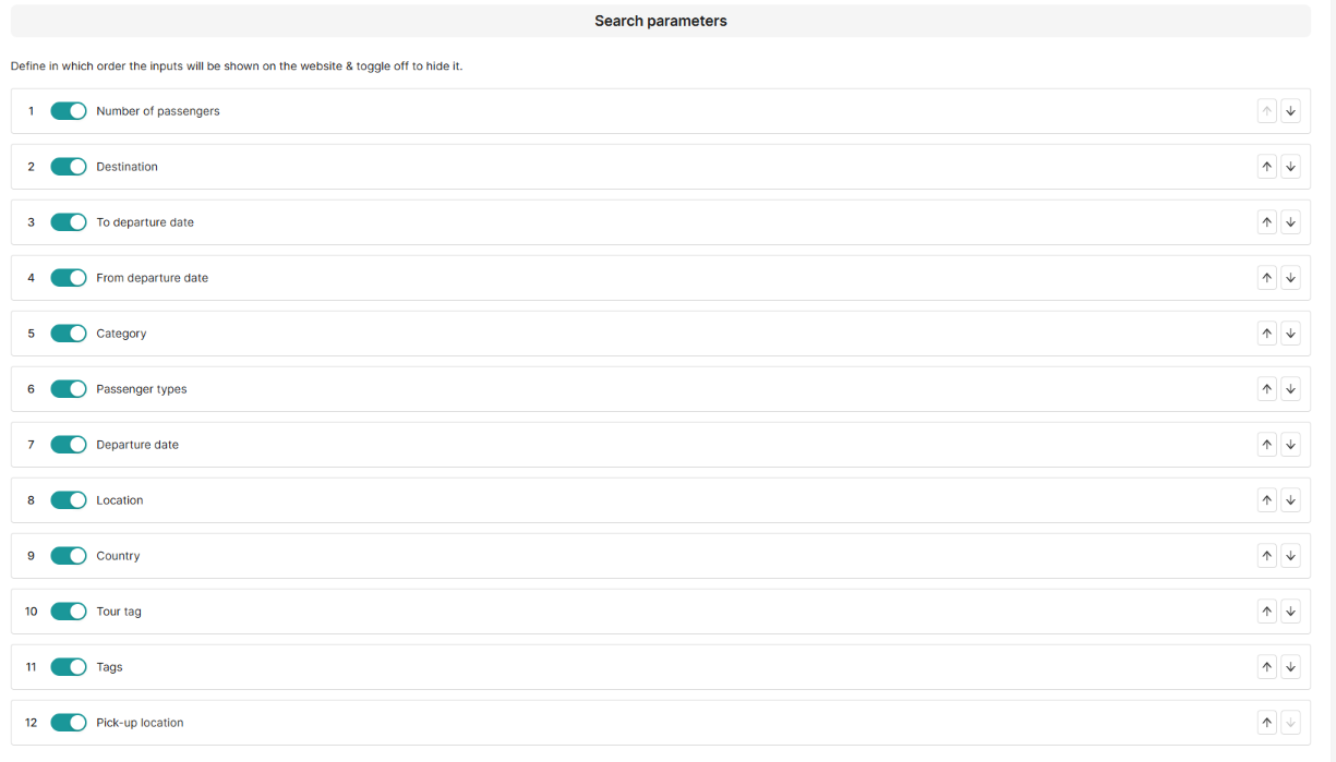
Hiding search parameters can impact user search experience—review carefully before disabling inputs.
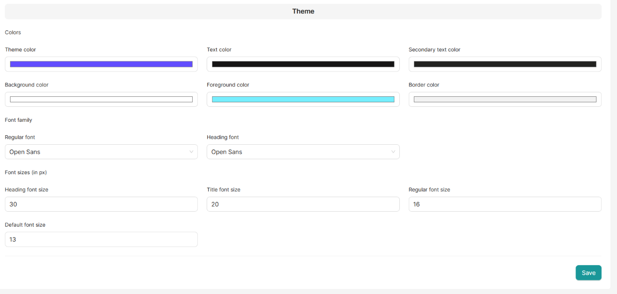
Step 5: Customize Theme Colors
- Scroll to the Theme Configuration section
- Click on the Theme color field
- Use the color picker or enter hex code (e.g., #2E7D32)
- Repeat for all color settings:
- Text color
- Secondary text color
- Background color
- Foreground color
- Border color
- All settings are displayed in preview mode when clicking the preview widget in the upper-right corner.
- Select Regular font family from dropdown
- Select Heading font family from dropdown
- Adjust font sizes if needed:
- Heading font size (default: 30px)
- Title font size (default: 20px)
- Regular font size (default: 16px)
- Default font size (default: 13px)
- Click Save
Field Descriptions:
Basic Configuration Fields
| Field | Description | Accepted Values | Example |
|---|---|---|---|
| Widget language | The default language in which the widget will be displayed to users | Language codes | English, Swedish |
| Currency code | The currency used to display prices in the widget | ISO currency codes | USD, EUR, SEK |
| Trips to display per page | Number of tours shown per page in widget search results | Number (1-100) | 20 |
| Default date format | Format used to display dates throughout the widget | Date format patterns | DD/MM/YYYY, MM/DD/YYYY |
| Show all tours by default | When enabled, displays all available tours on widget load without filters | Boolean (ON/OFF) | ON |
| Class name prefix | Prefix added to CSS classes for custom styling purposes | Text string | vaylo-widget- |
| Search redirect URL | URL where users are redirected after performing a search in the widget | Full URL with protocol | https://example.com/search-results |
| Booking redirect URL | URL where users are sent when proceeding to book a tour from the widget | Full URL with protocol | https://example.com/booking |
| Booking success redirect URL | URL where users land after successfully completing a booking | Full URL with protocol | https://example.com/booking-confirmation |
- Must include protocol (https://)
- Must be valid and accessible
- Should point to pages on your domain
- Test before saving
Search Parameters
Control which search inputs appear on the widget and their order.
| Parameter | Purpose | User Input Type |
|---|---|---|
| Departure date | Date when tour begins | Date picker |
| Tour tag | Category or classification of tour | Dropdown/Multi-select |
| Country | Destination country | Dropdown |
| Location | Specific city or region | Dropdown |
| Number of passengers | How many people are traveling | Number input |
| Tags | Additional tour characteristics | Multi-select |
| Destination | Final destination point | Dropdown |
| To departure date | End date range for departure | Date picker |
| From departure date | Start date range for departure | Date picker |
| Category | Tour type classification | Dropdown |
| Passenger types | Adult, child, infant, etc. | Multi-select |
| Pick-up location | Where passengers will be picked up | Dropdown |
Reordering: Drag parameters up or down to change display order
Visibility: Toggle switch to show/hide each parameter
Theme Configuration Fields
Color Settings
| Color Field | Where It's Used | Recommended Value |
|---|---|---|
| Theme color | Primary buttons, links, active states | Your brand's main color |
| Text color | Main body text, headings | Dark gray (#333333) or black |
| Secondary text color | Supporting text, labels, descriptions | Medium gray (#666666) |
| Background color | Widget main background | White (#FFFFFF) or light color |
| Foreground color | Cards, panels, content containers | Off-white (#F5F5F5) |
| Border color | Dividers, input borders, separators | Light gray (#E0E0E0) |
Color Format: Hex codes (e.g., #2E7D32) or RGB values
Font Configuration Fields
Font Families
| Field | Description | Applies To | Examples |
|---|---|---|---|
| Regular font | Font used for body text and general content | Paragraphs, descriptions, labels | Arial, Open Sans, Roboto |
| Heading font | Font used for titles and section headers | H1, H2, H3 tags, titles | Montserrat, Poppins, Playfair |
Font Sizes
| Field | Default Size | Where It's Used | Recommended Range |
|---|---|---|---|
| Heading font size | 30px | Main page titles, primary headings | 24px - 36px |
| Title font size | 20px | Section titles, card titles | 18px - 24px |
| Regular font size | 16px | Body text, descriptions | 14px - 18px |
| Default font size | 13px | Labels, small text, metadata | 12px - 14px |
- Larger sizes improve readability but take more space
- Mobile devices may need adjusted sizes
- Test across different screen sizes
- Keep hierarchy clear (heading > title > regular > default)
Next Steps
Now that you've configured the widget settings, learn how end users interact with the widget:
This guide covers:
- How search parameters appear to users
- Step-by-step booking process
- User journey from search to confirmation
- Summary and payment flow